Lattice.com Redesigned


A Pivotal Moment for Lattice
If you’ve ever previously visited our website, you might have noticed recently that things look a little different. Okay, maybe not just “a little” different; it’s more of an “Extreme Home Makeover: Lattice Website Edition” situation.
At the start of this year, our CEO Jack Altman tasked us with a big project behind a big launch: completely redesigning our website in anticipation of the upcoming announcement of Lattice HRIS. This launch was going to be more than just a big product bet; it was the boldest move Lattice had made since day one. And the website needed to match that boldly confident evolution.
We quickly realized two things:
- this project would need to be tackled in stages, and
- it would require a level of enthusiasm and teamwork that could only be described as “Type 2 fun.”
In anticipation of the global HRIS announcement in September, we began work on the first phase of the redesign with a plan to launch in early August. This allowed us to design our site's information architecture (IA), fine-tune our messaging, and establish the product visuals for the game-changing product announcement we knew was on the horizon.
Solving Business Goals with Design
Because of the importance of this moment for Lattice, and the understanding of the power of design, Jack and our SVP of Design Jared Erondu joined our web design syncs twice a week to brainstorm, dream big, and iterate.

This process supercharged our efficiency. We got strategic alignment in real-time, and we could make and revise right on the spot. One of the first and most essential outcomes from this process was alignment on the goals and principles that would guide all of our design decisions:
- Tell a “better together” platform story: We had a challenge that most prospects and customers knew us for one or two of our products, but not for every piece of our platform. We wanted to increase awareness for all parts of the Lattice platform, and show how our products’ interconnectedness creates maximum value for our users.
- Show in addition to tell: Be pragmatic and intentional with our user interface (UI) imagery and use animation to provide a peek into the product experience.
- Use storytelling to guide the user: Be explicit about our employee-first differentiation and make it easy for visitors to see how Lattice can help solve their problems.
- Confidently lead: Be bold in our messaging and design decisions.
The next step was executing.
Goal 1: Tell a “better together” platform product story
Homepage hero
Starting on the homepage, we wanted to make it super clear what Lattice is and how our multi-product platform helps businesses drive performance. Reimagining what a hero section could be, we put our products and their core benefits as high up on the page as possible. Our staircase modular grid complements our messaging, telling a unified story, and the product animations within the grid help users visually grasp our entire platform at a glance.
Better Together section
To visually showcase how each of our products are each purpose-built to work with each other, our “better together” module on our Product pages allows users to visually ‘add’ products together to see the increased value of their interconnectedness. They can also click through to the other product pages to get a deeper dive and learn more.
Information architecture overhaul
We audited our IA and sitemap, refining terminology and identifying user journeys. Terminology changes like changing the word “Products” to “Platform” helped our navigation match our messaging. As our IA became more focused on discoverability and the Platform story, our navigation became more robust, featuring all 19 of our products and subproducts, while creating real estate to display guiding visuals.

Goal 2: Show in addition to tell
Product cards and animations
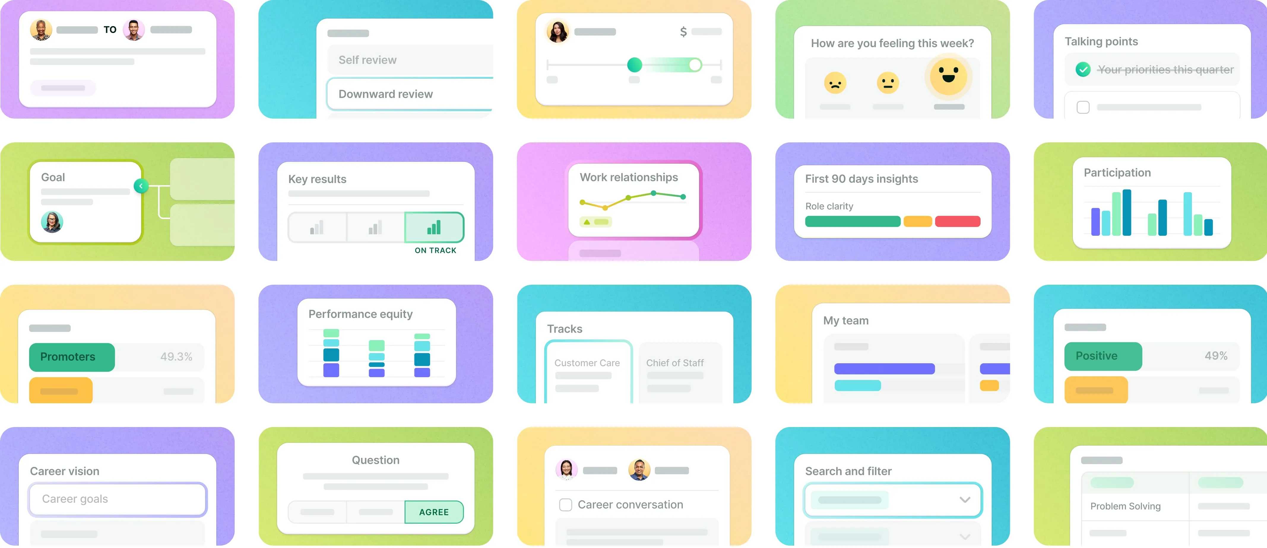
Our homepage and product pages use UI animation to provide a peek into the product experience. Not only does animation add a ton of delight, but it also showcases product functionality in a digestible way that contextualizes the copy for better comprehension.

UI redesign
To match the big changes in how we talk about our products, we also wanted to completely overhaul how we show our products. We rebuilt each of our 85 product screens from scratch using a consistent design system, and assigned levels of abstraction to correspond with how technical or simplified the product needed to appear across the site.
Visual tabs
In the spirit of being explicit about our platform’s breadth, we crafted a bespoke tabbed overview at the top of each product page. We used abstracted UI and a saturated background color to visually introduce users to the product and support the copy. The active tab color wraps around its respective content, making the entire module easily scannable and visually engaging.

Goal 3: Use storytelling to guide the user
Use case section
The use case section of our homepage offers visitors an opportunity to easily discover how Lattice can solve their problem by connecting them to examples of those solutions elsewhere across our site. Users now have different entry points to scan customer testimonials and product overviews, leaving them to ultimately choose their own adventure and choose the content that’s most relevant to them.
UI abstraction levels
We assigned levels of fidelity to our product imagery that correlate with its messaging. For high level or introductory images, our UI is highly abstracted.

As our content and messaging becomes more technical, so does the UI.

Goal 4: Be Bold
Evolved color palette
Being bold gave us the opportunity to transition from our formerly soft and limited palette to a more saturated and expansive one. Our new palette includes shades and tints across the full color wheel to allow us flexibility for bespoke brand moments, and indexes heavily on green as our anchor brand color.

These shades of green show up on product-related moments across our site, allowing for distinction that still feels unified within our primary brand color.

Innovative design elements
We crafted inventive and engaging design solutions to ensure visual interest and engagement for core sections of the site. Our staircase homepage hero, our animated video button, interactive product page tabs, and scroll-based value proposition sections are each examples of components we reimagined to be bolder and more engaging.
Streamlined narrative
Our pages are now shorter, with more product-centric, punchier messaging which allows for larger impact and easier discoverability for site visitors.

What’s next?
What’s next? is one of our company values at Lattice, so naturally we’ve been looking ahead to what this brand refresh means for the future.
We’re excited that clarity, storytelling, and bold delight have now become the guiding principles to our new visual language. Our next step is to apply this look and feel across the remaining pages of the website and build it into the rest of the Lattice brand. We’ll also continue using this rebrand as an opportunity to rethink our brand system at an atomic level, helping us address past design debt and stay flexible for the future.

Though our new look is out in the wild, we know our work is never truly done. There will always be new features, new campaigns, and a quality bar we strive to push farther. And we’ll keep evolving and growing the brand alongside each new development.
For more on Lattice Design, you can follow us on Twitter, Dribbble or subscribe to our newsletter here.

Your people are your business
Ensure both are successful with Lattice.


.webp)
.webp)